Morton Salt
Website Redesign
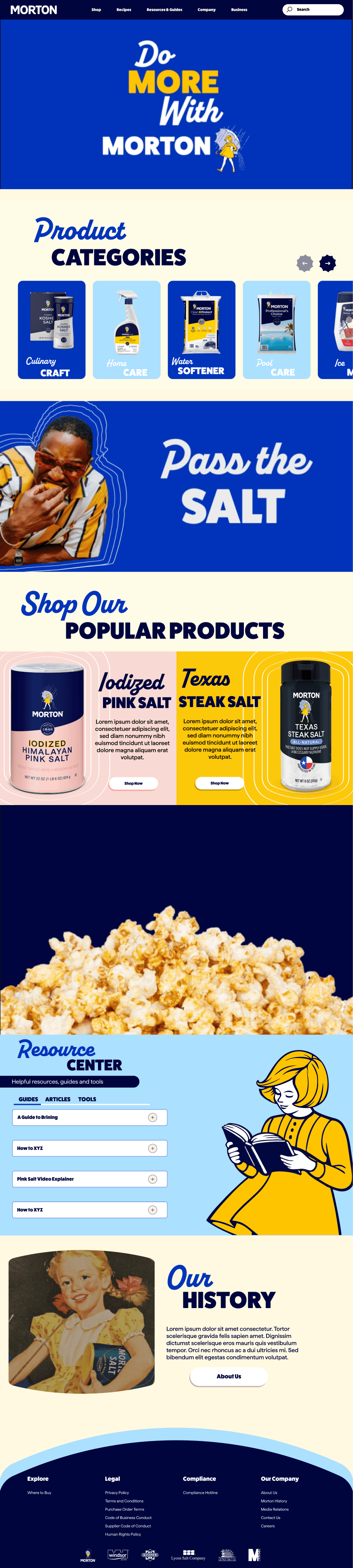
Homepage, 6,400px full-page layout
Morton Salt's site before this project was a flat product catalogue. No brand expression, no visual personality, and an information architecture built for one type of buyer when the business actually serves two very different ones: home cooks and commercial food manufacturers. Cerebral brought me on in February 2026 to rebuild it.
Seven page templates total, spanning consumer product pages, a salt substitution guide, recipe content, and dedicated funnels for food service distributors and food manufacturers. The Morton Girl, one of the most recognized mascots in American consumer goods, runs through all of it in three distinct poses built as rigged Figma components for Smart Animate transitions.
Why It Needed a Full Overhaul
Four specific gaps in the old site drove the scope of this redesign. Each one had a direct business cost.
Consumer and B2B buyers shared the same navigation and landing pages, creating confusion for both.
Separate funnels for food service and food manufacturing, each with its own landing page and product hierarchy.
Flat product grid with no path to related content. Buyers had no way to compare salts or find substitution guidance.
Product detail pages with substitution guides, size selectors, and recipe galleries to support the full decision.
No dedicated B2B pages. Commercial buyers hit the same consumer experience with no path to inquiry or sourcing.
Food Service and Food Manufacturing hubs with grade-specific product pages and direct inquiry CTAs.
The Morton Girl was absent from the digital experience despite being one of the most recognized brand mascots in the US.
Three illustrated character states across the site, each rigged in Figma for animated transitions between poses.
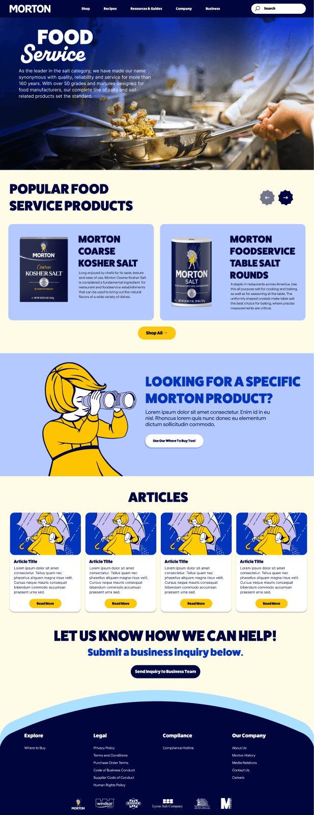
Food Service: dedicated B2B landing for distributors, with product grid and inquiry CTA
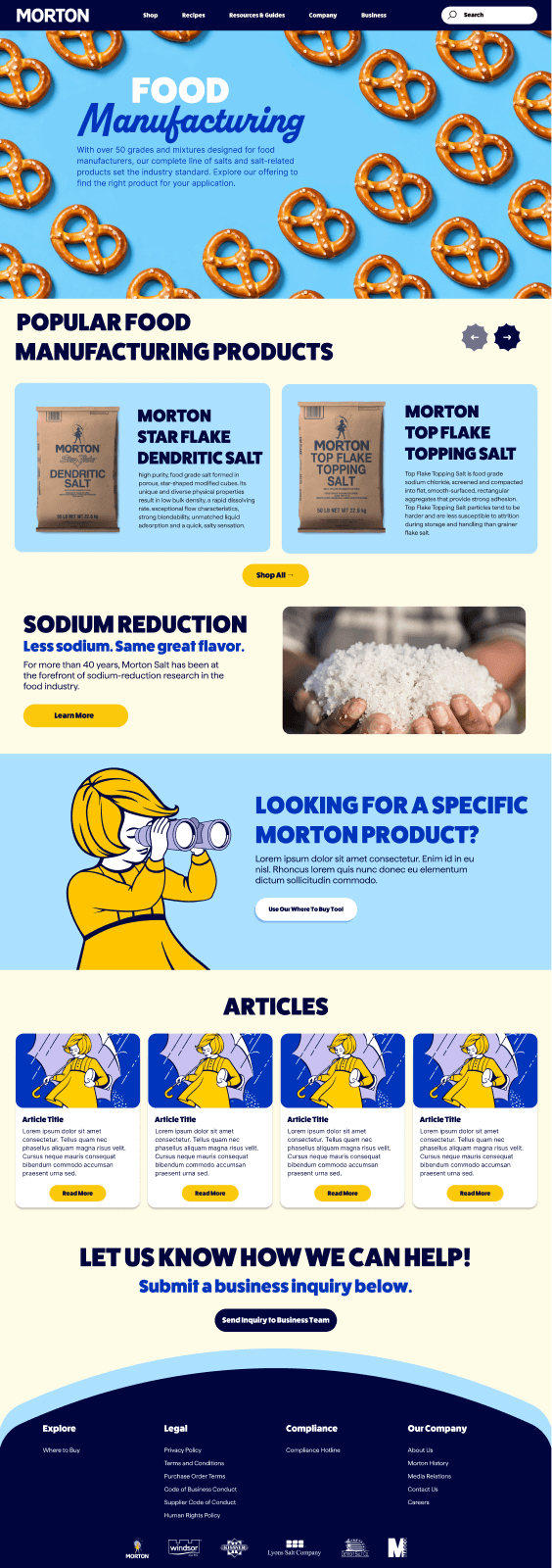
Food Manufacturing: 50+ salt grades, sodium-reduction research, and sourcing inquiry flow
Design System
Five colors and three fonts hold seven distinct page templates together. The same palette and type scale appear whether you're on a consumer recipe page or a food-grade product spec sheet, so the Morton Girl can cross contexts and still read as one brand.
The Morton Girl System
The brand mascot appears across the site in three distinct poses, each built as a layered Figma component with individually named body parts. That naming convention is what makes Smart Animate work between states.


Product pages, where the girl guides users to the right salt substitute
Each pose is a layered Figma component with anatomically named layers. That naming convention is what makes Smart Animate work: the head tilts, the arms raise the binoculars, the book opens. No cuts between static images. Actual tweened transitions.
Interactive Prototype
Full prototype with page transitions, animation sequences, and interactive components. Navigate from the homepage through product pages and into the B2B funnel.
Navigate between pages by clicking through the prototype
Page Designs
Seven full-page templates covering every audience and touchpoint. Consumer pages, B2B hubs, product detail, and the shop, all holding the same system.
The full 6,400px story
Hero animation, lifestyle editorial, product category split, Resource Center entry, and a seasonal recipe module. Every section has a job in the funnel. The Morton Girl appears in the hero and again lower on the page as a wayfinding device, not just decoration.
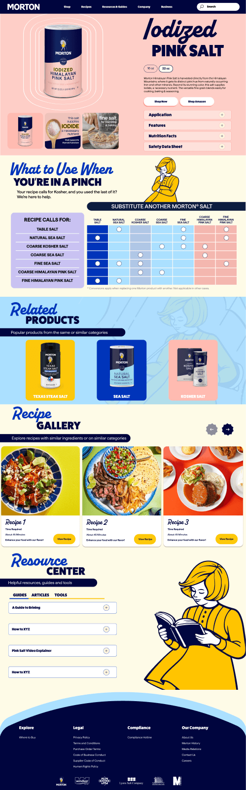
Size selector, substitution guide comparing Morton varieties, recipe gallery filtered by product type. Consumer PDP that does the work of a buying guide.
Below the fold, the PDP shifts into a substitution tool and recipe gallery. Comparing salts by use case keeps buyers on the page instead of bouncing to Google.
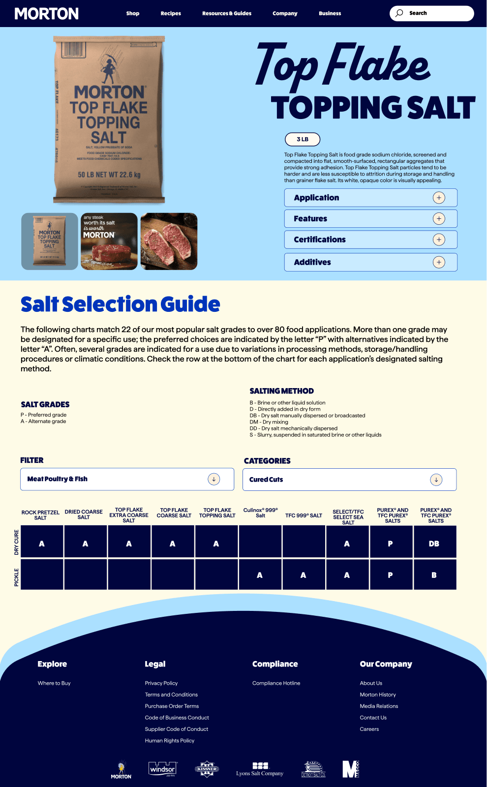
The salt selection guide
22 salt grades matched against 80+ food applications. The guide lives on the B2B product page so purchasing managers can verify grade suitability without leaving the PDP. Preferred grades are marked P, alternatives are marked A.
The supermenu
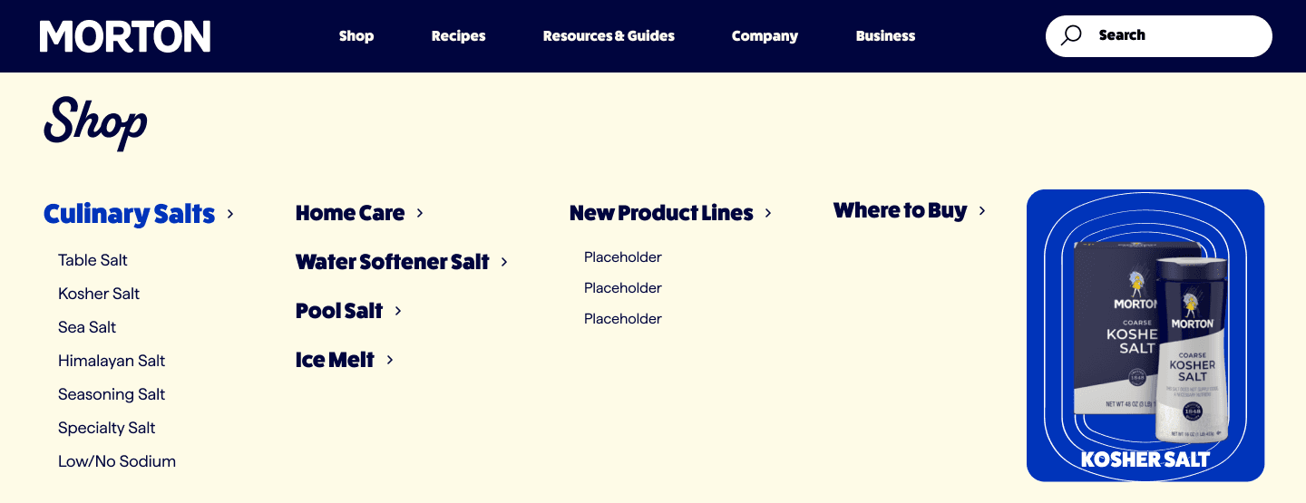
A full-bleed dropdown that splits consumer and B2B paths at the top of every page. Hovering Shop surfaces product categories; hovering Business surfaces food service and manufacturing routes. One nav, two audiences, no dead ends.
What this project taught me
Three things that only became clear once the work was done.
Animation as constraint
Building the Morton Girl as a rigged character with named anatomical layers forced component discipline that paid off in the prototype. Smart Animate transitions only work when layer names match exactly across states. That constraint made every decision more deliberate. The result is a character that feels alive rather than swapped.
Dual-audience IA is harder than it looks
The biggest challenge on this project was not visual. Morton sells to home cooks and food manufacturers through the same domain. Getting the navigation and landing page hierarchies right so neither audience felt lost took multiple IA rounds before Figma opened. The visual work was the easier half.
Extending a mature brand
With a brand as established as Morton, the work is not inventing a new visual language. It's understanding the existing one well enough to extend it into new contexts: e-commerce, B2B, mobile. The goal is to add without breaking what made it recognizable.